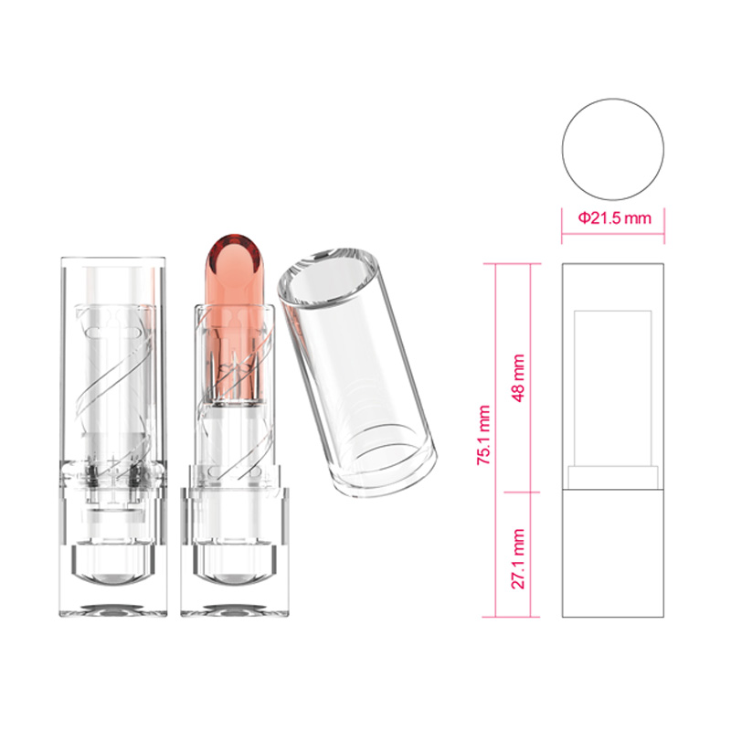
As my Cosmetic Packaging country’s material life is bec […]
As my Cosmetic Packaging country’s material life is becoming more abundant, people’s purchasing power continues to increase, and WTO accession continues to increase international trade, the difference between similar products has decreased, and the homogeneity of use value between brands has increased. Therefore, for consumers: Such products can attract their attention, and what kind of products they can choose to buy, which puts forward higher requirements on the packaging design of similar products. Only by working hard on the creative positioning strategy of packaging design can we make ourselves 'S products are "white and red, different." Creative positioning strategy occupies an extremely important position in the entire operation process of packaging design.

The creative component of packaging design is mainly reflected in design strategic creativity. The so-called creativity, its most basic meaning refers to a creative idea, a good idea, something that no one else has ever had. Of course, this thing is not made out of nothing, but is recombined on the basis of existing experience materials. Positioning strategy is a design strategy with a strategic vision. It is forward-looking, purposeful, pertinent, and utilitarian. Of course, it also has its limitations. Creative positioning strategy is the core and essential factor for successful packaging design. The following packaging creative positioning strategies play a pivotal role in packaging design.
The differentiation strategy of product performance is to find the uniqueness that similar products do not have as the focus of creative design. The research on product function or performance is the first prerequisite for a brand to go to the market and to consumers. For example, "white plus black" cold medicine, take white tablets during the day without falling asleep, and take black tablets at night to sleep soundly. Because the product functions and characteristics are different from traditional cold medicines, especially the tablet design and packaging design surround Black and white 2 colors make a fuss, so that this product can easily win a favorable position in the market compared to other similar products.
Some similar products are of similar quality and their respective expressions are also very similar. How to highlight the distinctive features, can not let go of any small features in the design. Such as Tide, Weibai, Diaopai and other laundry detergent packaging design. Most washing powders emphasize cleanness, cleanliness, refreshing, and quietness in the packaging design positioning. Therefore, the packaging design colors use green, blue, cyan, etc. with white to highlight their positioning ideas. Tide detergent adopts orange-red series to highlight the vitality and high efficiency of the product. As a large number of washing powder packaging adopts cool colors, it is of course eye-catching as a warm product with a strong contrast in color, just like "a little red in the green bush.